As indicated in a previous post, we are celebrating Mental Health Week here at Flinders from the 29th April to the 3rd May.
Preparations are well underway, involving staff from FUSA, OASIS and Health, Counselling and Disability Services.
I asked Media Officers Tim and Jess, who are giving Mental Health Week its identity to share some thoughts about the process. This is all part of a bigger goal to give students a bit of a ‘behind the scenes’ look at how an event like Mental Health Week comes together.
Tim shared a fascinating look into some of the considerations that go into the communication and design aspects of an event like this. I’ve included it below. A sneak peak into the design language for this year’s event is also included.
If you are anything like me and the world of graphic design and communication is a bit of a mystery, I think you’ll appreciate Tim’s analysis of how they approach an event like Mental Health Week.
Enjoy!
Any kind of design work has to abide by one simple, guiding principle: communicate, don’t decorate. This was especially important in our thinking on Mental Health Week, which presents a number of challenges as well as being rich in possibilities.
For that reason, close consultation with everyone involved at Oasis was incredibly important. In having day-to-day contact with matters relating to mental health amongst the Flinders student body, Oasis were the best placed of all us to provide insight as to the sensitivities, ethical concerns and practical dimensions to providing communications surrounding an event like Mental Health Week.
An important thing to arise from these discussions was that a lot of communication and design surrounding mental health is often too focused on mental health matters from a negative standpoint: mental illness, disorder, fixing problems, repairing. While it’s important to acknowledge these negative experiences and that there’s support available for students on campus, Mental Health, as Gareth has pointed out, encompasses a great deal more than just this and that research has shown messages of empowerment and control are more engaging than messages focused on moments of crisis. Moreover, from a public health perspective, it’s also important to cultivate attitudes towards mental health which emphasise checking in and fostering self-awareness, self-empathy and self-care even when you might be in a more positive space. Successful design strategies from groups working in the mental health area, such as the Headspace and Smiling Mind apps provide good examples of this – a complete lack of doom and gloom and offers of salvation, and more on concrete positive steps taken everyday, whether you’re in a good space or not. Mental health benefits from daily upkeep, which does not have to involve arduous struggle and overcoming of obstacles.
Taking this into account, as well as conducting research across the breadth of mental health design and communications, we found ourselves considering ways to communicate this more positive, empowering message, whilst being aware of the clichés often involved in mental health – brains, clouds, yoga poses. Initial ideas involved trying to represent ideas of self-care by way of tending to plants or to a garden – day-to-day care, maintenance, stimulation, growth. While the metaphor matched up pretty nicely on paper, in practice, when we played around with some photos of people gardening or caring for plants, this connection was a little too abstract. The ideas weren’t being communicated clearly.
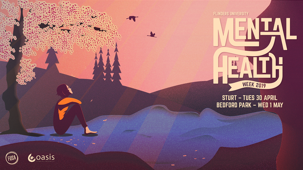
At this point we had two options – simplify our approach to the point where we were spelling this out in an explicit and literal way, or try to find another more subtle way of drawing these ideas to the surface. There’s always a time and a place for a literal ‘sledgehammer’ approach, but we felt that Mental Health Week wasn’t it – as noted above, there’s a richness to concepts of mental health and well-being that it’s important to honour in communicating these ideas. So instead we elected subtlety: what if we tried to communicate by evoking the tone of peace, well-being and self-care. Could we represent the experience of feeling at peace while sitting beneath your favourite tree in your garden, or while out walking in the forest?
In taking that scenario we had to think of what techniques would help bring those feelings to the fore. There’s a term used to describe the dramatic, stylised use of light and shadow amongst early modern painters called chiaroscuro (Italian for light and dark). Think Rembrandt and how pronounced the contrast between the lightest and darkest points of his work is. The effect is to dramatise and heighten the visual and emotional impact of the painting’s content. While none of us are Rembrandt and this is graphic design, not high art, this stylistic choice was a conscious one in really bringing the sense of peace, well-being and hopefulness to the fore. In having warm, yellow tones as our lightest point, and intensifying these by use of purple and blue shadow, we aligned the illustration with the warm and positive colours on the emotional spectrum.
Mental Health Week’s messaging will be aimed at encouraging students to take an empowered approach to their own well-being. It will focus on spotlighting self-care techniques, reducing stigmatisim and offering a wide range of resources on campus, outside of campus and within the digital sphere. Promotion of the event will be centered around an all-inclusive, positive approach and highlight the importance of tending to your mental health as a form of habitual self-care and something that can be done before things get out of hand.